
QR code colors: Maintaining scannability while building your brand
QR codes don't have to be black and white. Most modern generators let you choose colors, add gradients, or customize the appearance. The challenge is that while color customization looks good in design mockups, not all color choices actually scan reliably. The fundamentals haven't changed since QR codes were invented, scanner software needs clear contrast between dark and light modules to distinguish them. Understanding this constraint lets you make colors work without breaking functionality.
The one essential rule: Contrast
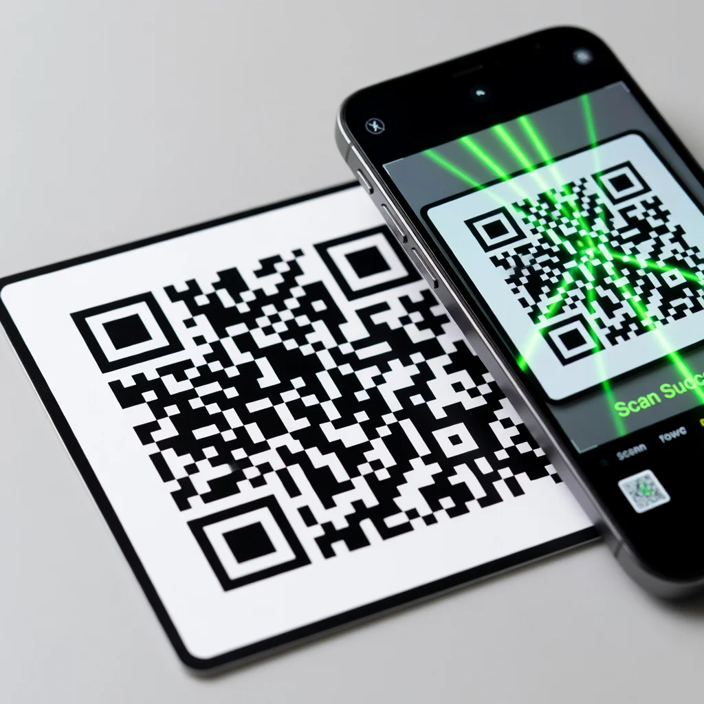
Everything about QR code color comes down to one principle: the dark modules (foreground) must have sufficient contrast with the light modules (background). Smartphone cameras and QR scanning software use this contrast to recognize where modules are and distinguish black from white. Insufficient contrast creates ambiguity, the scanner can't figure out where one module ends and another begins. This is the primary reason custom-colored QR codes fail. The color choice itself matters less than maintaining contrast.
What actually works: Color combinations that scan reliably
- Black on white: Maximum contrast, most reliable scanning, universal compatibility. The safest option.
- Dark blue on white: Strong contrast, maintains professional appearance, almost as reliable as black.
- Dark green on white: Adequate contrast if dark enough, modern aesthetic, works well.
- Dark purple or navy on light gray: Sophisticated look while maintaining sufficient brightness difference.
- Dark colors on light backgrounds (general rule): If the foreground color is genuinely dark and the background is genuinely light, contrast is maintained.
What fails: Color combinations to avoid
- Red and green: Difficult for colorblind users, and smartphone cameras perceive red-green contrast poorly. Avoid this pairing entirely.
- Light colors on light backgrounds: Insufficient contrast for any scanner to distinguish modules. An obvious failure, but mistakes happen.
- Similar brightness levels: A dark blue code on a dark gray background might look distinct to human eyes but looks nearly identical to a camera. The camera can't distinguish modules.
- Pastel colors: By definition, pastels have low saturation and reduced brightness, which reduces contrast. A pastel pink on a white background might be scannable but it's unreliable.
- Low saturation colors: Washed-out, muted colors lack visual punch and contrast. They look nice but scan poorly.
Checking contrast: The brightness test
The practical way to check if a color combination will work: does the foreground color appear noticeably darker or lighter than the background? Look at your code on a phone, not just on screen. Does it scan reliably? If you can't easily tell the difference between the dark modules and light modules when you look at the code, neither can a scanner. The contrast needs to be obvious, not subtle.
Using brand colors without breaking scannability
Your brand color is dark? Use it as the foreground (modules) on a white or very light background. A dark teal on white works. A dark forest green on white works.
Your brand color is light? Use it as the background with dark modules on top. A light tan background with black modules maintains contrast while incorporating your branding.
Your brand color is medium brightness? You can't use it effectively for a QR code. Consider using a darker or lighter variation instead, or stick with black modules.
Gradients and patterns: Proceed with caution
Gradients look trendy and design-forward. A code that gradually transitions from blue to purple might look great. But gradients reduce the contrast gradient across the code surface, some modules might be at the exact brightness level as the background, making them invisible to scanners. If you're using a gradient, ensure the darkest part of the gradient is dark enough and the lightest part is light enough. Gradients that fade too close to the middle brightness are unreliable.
Complex patterns or textures behind a QR code destroy scannability. The code needs to stand out clearly from its background. A patterned background competing with the code for attention confuses scanners and fails to scan.
Rounded modules: The design choice that doesn't work
You can't round the corners of QR code modules. Some design-savvy people try to soften the angular look by making modules slightly rounded or creating overlaps. This doesn't work. The scanner needs crisp, distinct module boundaries to recognize and decode the pattern. Rounded or overlapping modules create ambiguity that breaks recognition. If you want to customize aesthetically, stick to color and background choices, not shape modifications.
Logo and color interaction
If you're adding a logo to your QR code, the logo color matters. Your logo needs sufficient contrast against the code modules behind it. A light logo on light modules won't be visible. A dark logo that blends with dark modules creates problems. The logo should pop visually, it should be obviously different from the code pattern it sits on top of. This is another reason to test logo codes thoroughly before using them.
Printing color QR codes
Color reproduction varies between digital display and print. A color that looks great on your screen might print differently on actual paper. Test print samples of your colored code. Verify that the contrast you see on screen actually reproduces on the material you're using. Different papers absorb ink differently, and this affects color perception. Don't assume what looks right digitally will print correctly.
Accessibility considerations: Colorblind scanning
Red-green contrast fails for people with red-green colorblindness. If you use any red or green in your code, ensure there's also brightness contrast between the colors, not just color contrast. Better yet, avoid red-green combinations entirely. Blue-yellow combinations work well for colorblind users because they have sufficient brightness difference.
A/b testing: Does color affect scan rates?
You might wonder: does a black code scan more reliably than a blue code? In properly executed color choices (where contrast is maintained), scan reliability is essentially equivalent. What changes is engagement. A branded color code might see higher scan rates because it feels intentional and matches your branding. But this is user psychology, not technical scanning capability. From a purely technical standpoint, contrast is what matters.
The simple rule for success
If you're unsure about a color choice: would you be able to read black text on that background easily? If yes, the contrast is probably sufficient for a QR code. If no, choose different colors. This basic readability standard translates directly to scanner capability. Scanners are actually more sensitive than human eyes, but if something is hard for you to see, it's definitely too low contrast for scanning.
Conclusion
You can customize QR code colors effectively, maintaining your brand while keeping functionality intact. The rule is simple: contrast is everything. Ensure clear brightness difference between modules and background, test your colors on actual media before deploying, and avoid red-green combinations. Beyond that, choose colors that align with your brand. The code will work as long as the contrast does.
Try it now at FreeQRCodeGenerator.com →